The digital research method of creating image grids
Carlo de Gaetano, researcher at Lectorate Visual Methodologies.
Visual methodology is a form of qualitative research that relies on artistic mediums to produce and represent data. This method is different when compared to other research methods, with this methodology it isn’t immediately apparent what you will be able to do with your collected data.
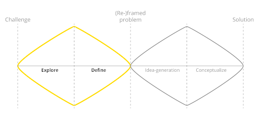
Visual methodology is usually applied during the exploratory phase of a research or design project. The collected data will give you insight on how your research topic is represented on the internet. Furthermore the collected data has the potential to give you a different perspective on the selected topic, which can then help you create new imageries surrounding said topic. These new imageries can help shine a new light on your research topic. In order to apply this methodology, you will need to use a couple of tools. In this example we explain:
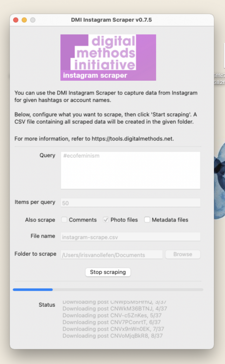
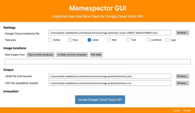
DMI is used to scrape images from Instagram, besides scraping the images it also collects the metadata that comes with those images. There are alternatives that you can use such as Apify and Phantombuster. These scrapers can run into issues, because Instagram tries to prevent external applications from scraping their data, this is why scrapers need to be updated frequently in order to prevent Instagram from catching on. Memespector is used to add tags to your images such as ‘font’, ‘girl’, ‘beach’ etc., which you will later use to create a network of labels and images.The credential .json is necessary to run Memespector. Gephi will allow you to visualize your collected data by using the tags that Memespector created.
“When thinking of images online as digital objects we have to think beyond the single image. They are embedded in a digital context and they never travel alone.”
As mentioned before, visual methodology is a form of qualitative research that relies on artistic mediums such as film, photography, illustrations and sculptures to produce and represent data. Besides revealing information on what the artistic medium captures, it also reveals information of the artist who created the medium, the context in which the medium is presented and other metadata that can be extracted from said medium.
Once you have explored this method you are left with a clean overview of your collected data, both visually and textually. You will have an overview in the form of patterns and clusters of what lives on the internet regarding your research topic. It allows you to gain a better understanding of how people online view the topic and how differently subgroups interpret your research topic. With all of the collected data you will be able to not only see your research topic from a different perspective, but also decide the further direction of your research project.
Visual methodology is mostly used in the exploratory phase of a research or design project. It can also be done later in your project, once analyzed the incoming data, to define the direction of your project.
For this method you will need a computer with Excel, Google Sheets or any other program where you can import .csv files. Other than that you will want to have figured out which research topic you would like to explore, as well as the following software:
Optional is Adobe Illustrator or an online concept board where you can annotate your visual data.
Once all the software is set up you can start with the DMI Instagram Scraper.
As this is an open source software it might not work the first time. Try restarting and/or waiting fifteen minutes. An alternative to this is Crowdtangle, however this is a paid product.
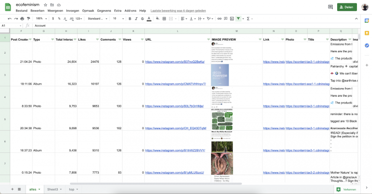
You are now left with a .csv file which you can open in Excel, Google Sheets, or any of your prefered programs which allow .csv import.
All of your data is now placed in a nice spreadsheet, but what can you do with this?
As a result of these steps you now have an overview of the top images from each keyword. From here on you can explore what it is that you are seeing and also what it is that you are NOT seeing.
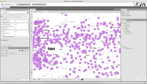
The next part of this method is done in Memespector, Table2Net and Gephi.
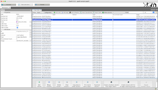
You are now left with a .csv file with the tags that Memespector has given to your images. To create a network of images and labels you will use Table2Net.
The .gexf file you can open in Gephi. In order for this software to work you have to have the latest java running on your device. You can download this here.
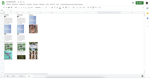
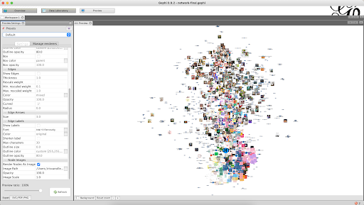
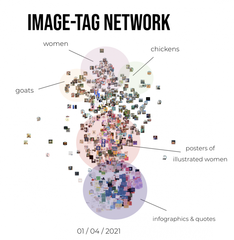
All these steps will leave you with a .svg file full of images which can be very chaotic. The next step is to either print this or open it in Adobe Illustrator and analyse it. There you can find any interesting clusters that spark your interest and mark these.
Images travel around the internet with certain metadata. This data includes hashtags, timestamps, likes, of course the picture itself and also, depending on the platform, mentions of other users, captions, comments and so on. Images are part of a larger network and this method can help find links between different ones. A single image may become closer to another because they are posted with the same hashtag, for example.
Visual Methodologies can, when working correctly, process a large amount of data really quickly which can be collected and observed thoroughly. Using the right tools, these methods allow you to filter and gaze through the top results. This lets you not only look at the top results, but also see how these change over time. Another interesting way of looking at the data would be to figure out what is NOT in the top, maybe you expected something particular out there.
Other interesting data you can collect with this method is a view of different clusters of images which are popular within your research topic. This can give you very useful insights which you can use further on in your research project.
The time spent on this method can differ tremendously. Not only because you can do as little or as much as you like, but also because it depends on how well the technology is working in your favour. Coming back to the former, this method can be done on several different levels. Simply scraping the images, putting these in a spreadsheet and analysing those images can by itself give very good insights. If you want to dive deeper into the data it is possible to work with Memespector and Gephi, which will of course add more time to the process.
Just collecting the data will take about an hour. Observing it can take up to anything between one hour and several days/weeks. This all depends on how much data you want to analyse.
Reading through all this information and all the steps a person has to go through, this method can quickly sound very complicated. However, once you get the hang of it, it does become easier.
A lot of the programs that are used in this method are Open Source, which means you can download and use them for free. This also means it is usually more buggy than when you buy a certain program for money, because there is an expectation for support from the maker.
Designers might usually not work with spreadsheets and big files filled with data in their day-to-day work. This means it can be difficult to start with, especially when you have to follow certain steps, because there is a possibility it might not work otherwise. This feeling comes back multiple times when using the next program.
This method is definitely manageable, especially if you follow the guide above, it will make it very clear. But it does take some time and research to really understand the steps you are taking. You can build an amazing network of connected images and keywords or hashtags, but don’t expect it to work immediately. Just like Rome wasn’t built in one day, your image network won’t either.
So what are the actual pro’s and con’s to this method? Let’s list them out.
Overall, this method is very interesting. You get to do some actual deep digging research through data and are left with a very visual overview. This is not usually the case when working with big data files, the most visual it gets is a line graph! It is definitely worth taking the time for, because you can find so many wonderful insights in the result, it just takes some time to get to the end result!
These results can be hugely beneficial for your research project, especially in the exploratory phase. It can help you determine in which direction to continue. On the other hand, if you’ve already specified a specific direction, the Visual Methodologies with Gephi can give you some valuable insight in the topic you are researching.
Photovoice is a method in which participants take and collect photos themselves. These images surround a certain theme and are meant to spark a discussion, which is followed by a mapping session done by the participants. In a way this means that you do exactly what Gephi does by looking at the images, but manually and it also allows you to look at the meaning behind an image instead of just the looks of it.
With an inspiration wall, you organize ideas during a project. This almost looks like a physical alternative to Gephi. You print out pictures and other inspirational ideas that you can then elaborate on. This is a good way to collaborate with users and is therefore more co-creation than data analysis. If the work with Gephi is too complicated or boring, you can see this as a good alternate method.
Instead of scraping Instagram and using software, all of this can be done manually. But, even when doing this with the used software, you can also do it with different goals. Instead of using visual methodologies as a way to find out the ‘known unknowns’ you can also use it to actually analyse trends and find connections. Afterwards, you can continue diving in to the trends and do your research with that.
‘Project All Gone’ is a series of experiments with artificial intelligence (A.I) that builds on an existing collection of climate fiction to create much needed new climate imaginaries. The reason why the researchers have chosen A.I is because co-authoring with A.I gives them the chance to break free from major existing narratives and allows them to refresh their imagination of the future with a changing climate. The researchers have already researched climate change and climate scepticism as it is discussed and depicted on the web and across platforms such as Wikipedia and other social media. They have looked into and worked with climate imagery, climate movements, NGOs and how people tell stories about the climate. Central to all climate-related discussions are future projections, Where are we headed if we don’t change our ways? What will disappear? Which parts are the most vulnerable to the effects of climate change? What is at stake for the near and distant future? Most of these projections created in scientific literature, journalism, or the entertainment industry are presented to us over and over again until they stick.
‘Turning to the birds’ is a podcast that is derived from the All Gone Project. It is written by A.I. and edited by humans at the Visual Methodologies Collective. The collective generated lists of popular works of climate fiction, which allowed them to let the A.I. machine write a short story by entering dates in the future. The machine was then able to complete a story for that specific date. It was decided that humans would correct the draft, only slightly, for sake of legibility. Text-to-speech technology was used to turn the diary into a podcast series. You can listen to this on several different platforms such as Apple Podcasts or Spotify.
Aidan Omwando, Beate van Garderen & Iris van Ollefen